
Rekobyte: A Redesign for a Tech Guide Site

A full design pass for a site of Windows guides, smart home advice and free tools: a sticky header, mega menus, an article layout built around reading and one look across every page.

Site
Rekobyte

A tech guide site covering Windows, smart home and everyday devices, with four free tools.

Services
Web Design and Development

A redesign, mega menus, a new article layout and rebuilt About and Contact pages.

Platform
WordPress

Elementor pages with a custom design layer in PHP, CSS and JavaScript.

Timeline
September 2026

Designed, tested and launched within the month.

Where It Started

Rekobyte publishes plain-English guides to Windows 11, smart home security and everyday tech, plus four free tools. The library had grown to 39 guides across eight topics, and the design hadn’t kept pace.

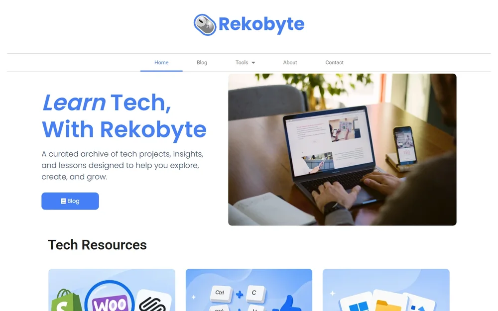
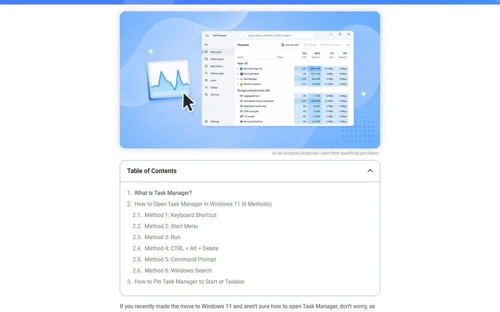
The homepage opened on a plain white hero. The menu was a simple dropdown. Article cards cropped their featured images into a fixed band, and a long guide kept its contents list inside the article, with a side copy that only faded in once that had scrolled away. Behind the scenes, every topic page listed all 39 guides rather than its own.

The goals

What the Redesign Had to Do

Before and after

The Old Design Next to the New One

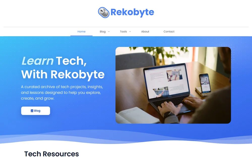
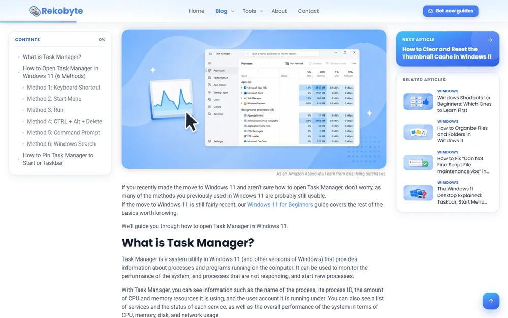
The homepage and an article on a desktop screen. The before shots were taken from the live site the day the redesign shipped; the after shots are the same pages in September 2026.

The Homepage

A plain white hero became the brand’s gradient with drifting waves, and the menu gained Blog and Tools mega menus.

Before
Rekobyte's old homepage: centered logo, plain white hero and a laptop photo
After
Rekobyte's new homepage: blue gradient hero with waves and the laptop photo

An Article

The contents moved out of the article into the left margin, and the right margin now names the next article and suggests related ones.

Before
An old Rekobyte article: featured image with the contents list inside the article
After
A new Rekobyte article: contents rail on the left, next article and related reading on the right
Web design

The Redesign

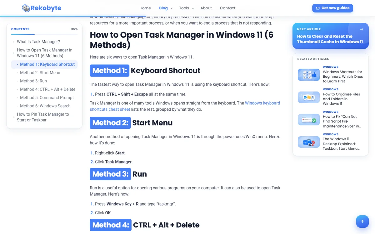
The redesign is one design layer on top of the existing WordPress and Elementor site, so none of the 39 articles had to change. It styles every template, adds the new header, menus and article margins, and rebuilds the About and Contact pages. Tap the numbered points on the screens below to see why each part is there.

A Rekobyte article mid-read on a laptop: sticky header, contents rail and related articles
A header that stays

Once the main header scrolls away, a slim one takes over: the logo, the same menu with both mega menus, and a Get new guides button. The blue line under it tracks your place in the article.

Contents beside the article

The whole contents list sits in the left margin from the first screen, level with the featured image, and travels with you. The section you're reading lights up.

How far you've read

A percentage and a small bar count up as you read and reach 100% on the last line.

The next article, named

Next article, with the title written out, so it's clear where the click goes. It's the next guide on the same topic when there is one.

Related reading

Four more guides from the same topic. On product roundups, this panel gives way to a card for the product you're reading about while you're among the picks.

Back to top

Appears once you've scrolled and bows out before the footer, which has its own button in the middle of its bottom row.

An article, mid-read

Tap a numbered point, on the image or here, to see why it's there.
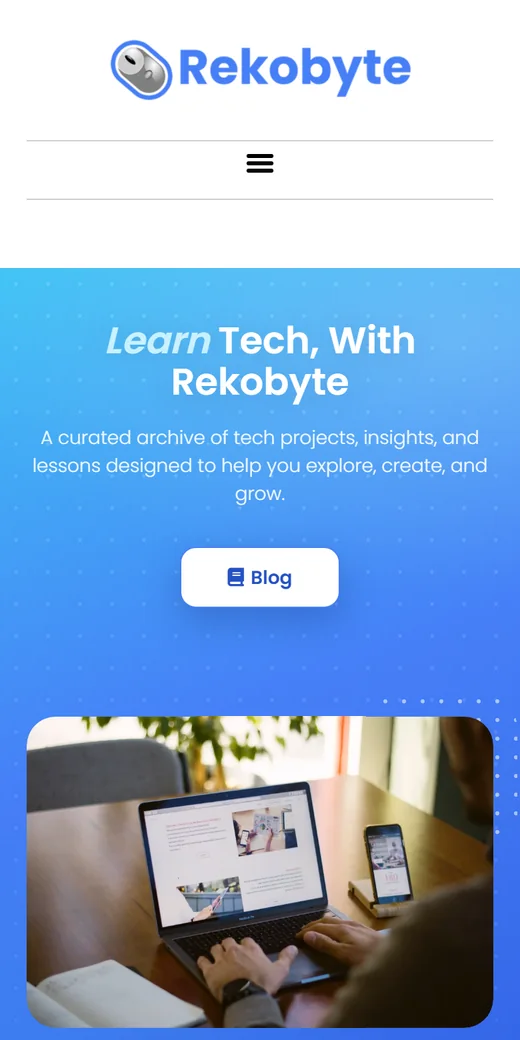
Rekobyte's homepage on a phone: gradient hero, headline and photo
The brand's blue

The hero runs from the logo's cyan to a deep blue, with a faint dot field and soft glows. Waves drift slowly along its bottom edge.

A photo that wipes in

The picture reveals itself from left to right as the page opens. The whole first screen animates with CSS alone, so it never waits on a script.

The homepage on a phone

Tap a numbered point, on the image or here, to see why it's there.
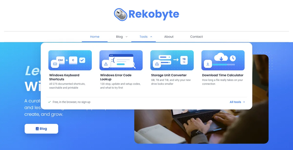
Rekobyte's Tools mega menu with four illustrated tool cards, on a desktop monitor
Opens on hover or from the keyboard

A short hover delay stops it flickering as the pointer passes. The arrow opens it from the keyboard, focus moves inside, and Escape closes it.

A drawing for every tool

Each tool has its own illustration in the site's blues: keycaps, an error screen, drives and a download bar. They lift when you hover the card.

Icons that match

One line-icon set runs through the menus, the About and Contact pages and the newsletter panel, so they all speak the same visual language.

Every tool, one click

A footer row says what visitors want to know first, free and no sign-up, with a link to all the tools.

The Tools mega menu

Tap a numbered point, on the image or here, to see why it's there.
Pages and details

The Pages Around the Guides

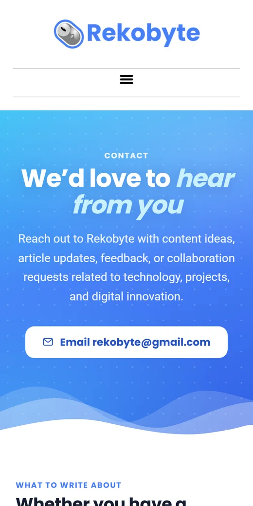
The About and Contact pages were a heading and a few lines of text each. Both were rebuilt with photos, clear sections and a gradient header to match the homepage, and the Contact page leads with a button that opens an email.

Smaller fixes ran alongside: the pieces a reader only notices when they’re wrong.

Rekobyte's Contact page on a phone with its email button
Motion and accessibility

Motion That Stays Out of the Way

Every page arrives from the top down. The first screen animates with CSS alone, and everything further down fades in as it scrolls into view. Nothing already on screen is ever hidden, and nothing waits on a script to appear.

In short

What Rekobyte Has Now

Currently taking new projects

Let's Work Together

Has your site outgrown its design? Tell me about it. You’ll hear back within two working days.